Understanding Colour Management in Photo Printing May 30, 2017 04:21
Colour Management
Refers to the use of processes and technologies to maintain colour consistency while reproducing a photograph or a work of art. Achieving a colour match between what is viewed on the monitor, or an original work of art, and what is eventually printed is a complex task.
All the devices, applications, materials* used throughout the workflow play a key role in controlling the colour accuracy and consistency necessary for optimal results.
*scanners, computer monitors, printers, inks, papers, ICC profiles and photo editing applications
Colour Space or Gamut ‐ sRGB, Adobe RGB and ProPhoto RGB
A Colour Space simply describes the range of colours or gamut, that a camera can see, a printer can print, or a monitor can display. Colour spaces used for editing such as; ProPhoto, Adobe RGB or sRGB, are device-independent. They also determine a workable colour range. Their design allows you to edit images in a controlled, consistent manner.
Gamut
The gamut describes the range of colours that can be reproduced and processed by devices such as a monitor or a printer. The expression “out-of-gamut” means that the colour cannot be shown accurately on the target device, for example when a printer cannot convert or produce a colour that is shown on the monitor.
RGB
Red, Green, Blue is a monitor's native colour space and the system for capturing and displaying colour images electronically. All TV, computer, and electronic displays create a colour using these three primary colours, RGB.
sRGB / Adobe™RGB, / ProPhoto® / Melissa® RGB
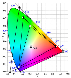
The coloured horseshoe represents visible colour. The smallest triangle is the range of colours in sRGB, the middle is Adobe RGB, the largest is ProPhoto RGB.
sRGB
sRGB is the “standard” of the web and most photofinishers. Designed in 1996 by Microsoft™ and HP™, sRGB has the smallest spectrum of colours of the primary colour spaces. sRGB was primarily designed for the computer industry as a way to standardise colours on monitors and printers. Most cameras use the sRGB colour space when saving an image. Only higher end cameras have the option to save in either sRGB or Adobe ™ RGB.
Adobe ™ RGB
Adobe ™ RGB was designed in 1998. It was created in response to the growing computer graphic arts sector looking for a way to duplicate the spectrum of colours created by the CMYK printing process. Adobe™RGB offers a wider range of available colours than sRGB, so it wasn't long before it lead to a wide adoption by photographers.
ProPhoto
ProPhoto RGB was created by Kodak™ in 2003. ProPhoto RGB started its life out as ROMM RGB. Built from the ground up as a colour space to supplicate all the colours visible in Ektachrome® slide film, ProPhoto RGB has one of the largest colour gamuts out there. Designed by photo experts for photography, ProPhoto duplicates most of the humanly visible colours that occur in the real world, surpassing Adobe RGB, and sRGB colour spaces.
Melissa RGB
Melissa RGB is another Adobe™ defined colour space. Melissa RGB utilises the ProPhoto colour spectrum and applies the Gamma curve from sRGB, providing the best of both colour spaces. It is only used inside of Lightroom® for manipulating your RAW files. Although you cannot select another working colour space while processing in Lightroom®, you can select an appropriate colour space when exporting.
Most Camera's
Most cameras will tag an image with the colour space when saved as a jpeg at the time of capture. Sometimes this information can get lost through editing and saving images in different formats. It's important that when editing in a different colour space other than what is native to the image; that you make sure you tag the image with a colour space before submitting your images to for printing. If this information is not available, then we will assign the most suitable colour space on your behalf.
If you found this helpful, you might want to visit dpBestflow.org to learn more about Colour Space.
D-Max
D-Max stands for maximum density. It indicates the deepest black a paper and ink combination can produce. The higher the D-Max value, the better. A D-Max of 2.0 is considered excellent and approaches that of traditional photo processing materials.
The goal is to exceed a D-Max of 1.6 for matte fine art papers and 2.0 for glossy, satin, or pearl papers (which have the best D-Max potential). The goal is to achieve the best all-around quality given different display conditions. For instance, a glossy print under glass can have more reflection than a matte print. However, the attributes of the glass might cause a perceived loss of black density. It is important to take this into account when choosing a paper.
ICC (International Colour Consortium) Profiles
An ICC Profile is a colour management industry standard that helps specify the attributes of imaging devices (digital cameras, scanners, monitors, printers). These profiles contribute to the rendering of colours resulting in a more accurate print.
ICC Profiles are similar in function to colour spaces in that they define a finite range of colours. However, unlike colour spaces, ICC Profiles define the range of real colours an output device (such as a printer) can produce, making them an integral part of a professional printing workflow.
ICC Profiles are used in three ways.
- Profiles render a soft proof that simulates how colour is affected by the printed media (paper or canvas).
- Tells the printer what kind of media is being printed.
- Converts the colour space of an image to the ICC Profile for the destination output device (which we don't recommend).
ICC Profiles are a necessity for any colour-controlled workflow. They not only give you a good idea of what your output will look like when soft proofing, but they definitively tell the device how to render the colours when the ICC Profile is applied.
With a good image editor application such as Photoshop®, and a correctly calibrated monitor; an appropriate ICC Profile created for a specific printer and paper combinations will allow you to soft proof your images.
Soft Proofing and Colour Proofing on Your Monitor
Although a soft digital proof can be provided upon request for your review, soft proofing should NOT BE INTENDED FOR COLOUR APPROVAL. But rather to review any restorative and retouching techniques applied to the physical elements within the image.
Unless your monitor is properly calibrated, there is always a chance that the colour you see on your monitor may not accurately resemble what we see. Our monitors are designed specifically for image reproduction and are calibrated on a regular basis to ensure that we are viewing images under consistent conditions and that the colour is as accurate as possible.
If judging colour is a critical step in your process, please contact us. We can arrange a time for you come and view your image(s) on our monitor so you can see how they will print. Or, you can order smaller test prints of your image(s) and judge for yourself how your print compare to your monitor.
Calibration tools and monitors available at:

Vistek | Canada's Photo, Video and Digital Store